


There has been a bit of a renaissance in American animation lately: shows are being aired that take more chances and explore more complex themes and characters. As with every new generation of talent, these shows are being made by people who seek to fix a lot of the problems they saw in their shows growing up, both in the shows themselves and the things surrounding them.
One such problem is the lack of quality licensed games for such cartoons. Now, not only are networks are handing over rights to some of their biggest franchises to well-regarded smaller studios like Platinum and WayForward, but are letting the show’s creators consult on the projects as well. This has led to a flood of excellent titles made by people who truly excel at translating a show’s strengths to an interactive medium. The most recent in this line of successes is Steven Universe: Attack the Light, a game that seeks to fill the void that games like Paper Mario have left lying around in their absence and deliver an RPG that is a perfect fit for mobile.
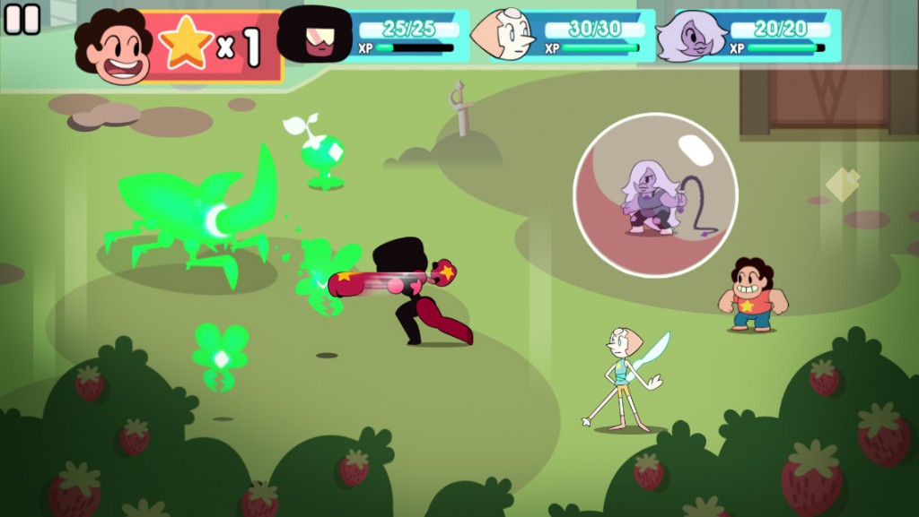
More than anything, it seems like the developers at Grumpyface Studios took care into examining how to make an RPG that plays to the strengths of the platform of smart devices. Play segments are framed in small dungeons that take generally under five minutes to complete. The battle system and movement all rely on simple swipes and taps. Movement is handled simply by scrolling screen to screen, a natural motion for mobile devices and one that translates well to a grid-based map. Frequent hidden treasures strewn throughout the screens are a good way to encourage exploration, and the use of visual language in the map design helps keep hidden areas and item caches visible across different worlds.
More could have been done to make this even clearer across the differing tilesets for the worlds through contrast or maybe a subtle particle effect, but as the act of attempting movement or checking a suspicious sprite is so minimal for this interface system, it is almost a moot point. I cannot stress enough how intuitive and snappy this movement system is; it’s so well-suited for mobile use, and it allows levels to be finished quickly while still functionally covering a lot of ground.
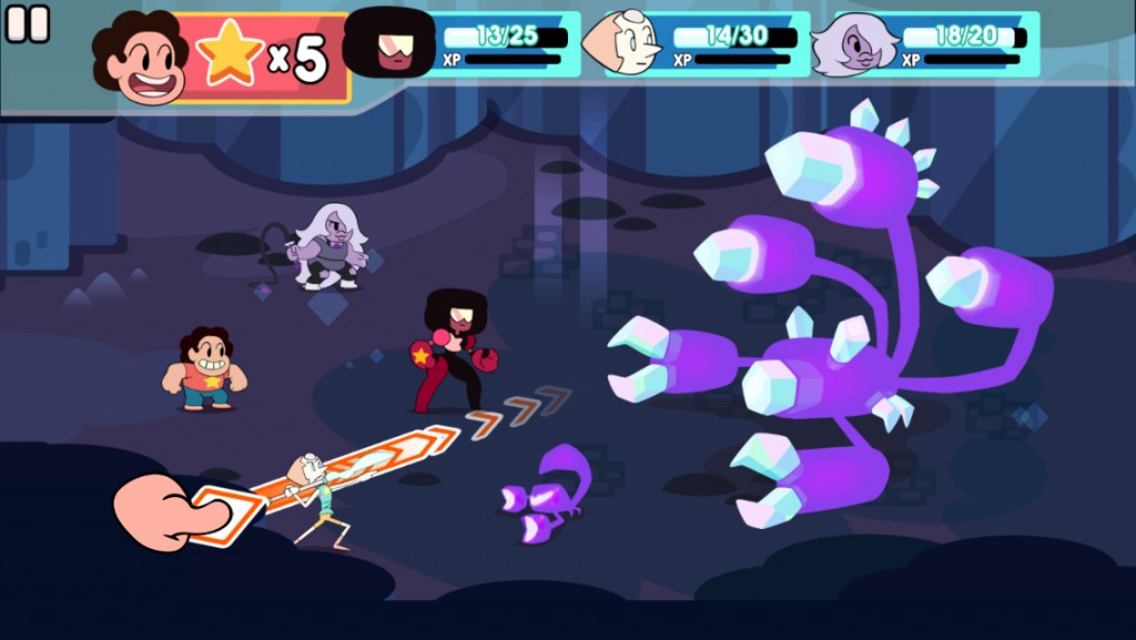
The battle system also takes a lot of cues from mobile interface design ideas, as well as from battle systems of the Paper Mario games. During combat, you touch a character, and then a selection of actions appears in a circle around them. During the attack, you can tap the screen at specific intervals to deal critical damage. Other attacks require dragging and aiming a projectile Angry Birds-style to hit airborne enemies, or mashing the screen to get as many attacks in as possible. It is these mechanics that prevent the battles from turning into minimally-engaging grindfests. By requiring you to be attentive and focused on every action in the battle, you can’t afford to be disengaged. Even if you’re sufficiently leveled to eliminate every enemy without critical hits, the audiovisual feedback still drives you to time your taps correctly to land a critical with every hit.
The main issue with Attack the Light is really its timing system. When determining when to press the button for a critical hit in Paper Mario, there is always either easily-understood spatial reasoning (Mario’s jump and proximity to the enemy), or some sort of gauge to determine the correct timing. There’s always an intuitive build-up to the event. Attack the Light doesn’t have this same build-up, and that makes determining the correct timing more difficult. While a star symbol does flash before you are meant to attack, the logical connection is not as strong, and the time which the star flashes just “feels” off. An action like a punch does not have the same gravity and certainty as Mario’s jump, and the lack of visual aids such as the gauge make it difficult to determine timing without waiting for the star and tapping when you see it.
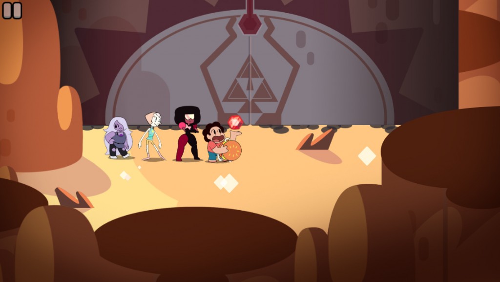
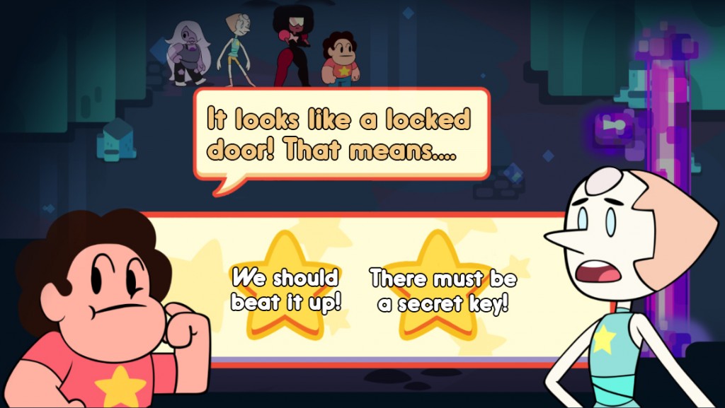
Rebecca Sugar, the creator of Steven Universe, worked with Grumpyface Studios when creating the game, writing a canon story for the game and consulting on the art direction. It really does feel like the writing carried over, too: all the conversations and cutaways feel natural and charming, very much in the spirit of the show. The artwork takes the bubbly shapes, fluid movement and warm color temperature of the show and simplifies it to a smaller, more “chibi” format. This works very well for the game, and gives it a personality all its own. The voice cast for the crystal gems are all here to reprise their roles, as well; this truly looks, sounds and plays like you would expect a Steven Universe game to play.
It’s so nice to see networks put actual thought into the studios that make their games, and are seeing them less like merchandise and more as a means to complement the shows themselves. We need more licensed games like these: Steven Universe: Attack the Light is the game the show deserves.
Pros: Cute art style, engaging battle system, intuitive interface
Cons: Odd timing system, few options for pure maximum damage output