


I’m thankful my Snackbar duties don’t extend to reviewing games. I don’t have the objectivity to separate my feelings from actual game design. I’m a sucker for emotional impact and that is my greatest influence when discussing games. There are just too many factors to contemplate when considering an overall score. Would it really bother me if there’s clipping on level six? How about if the plot isn’t original? Is there multiplayer?
One of the weirdest aspects of a game to review, I would think, is the presentation. Much like with food, with video games it really matters. What does the box art look like? Does everything “fit” with the overall theme? How long are the load times? My ultimate decision on presentation, however, boils down to the menus.
What’s in a menu? How important could navigating selections against an animated or static backdrop be? When it comes to emotional connection and reducing frustration, more than you’d think. Good menu design gets players into the game faster, but also sets the tone of the world and prepares the players for what they’re about to experience.
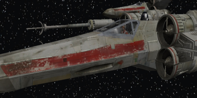
Let’s start with one of my favorite examples, Star Wars Rogue Squadron II: Rogue Leader. Now, you’d have to screw up pretty badly to not take advantage of a license like Star Wars. There’s almost too much content between the space opera story, classic characters and iconic soundtrack. But Rogue Squadron II knocks it out of the park and showcased the full capabilities of the GameCube, even from the first menu screen.
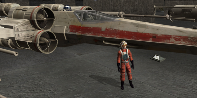
How apt it was that Rogue Leader was one of the GameCube’s first games worth talking about. It launched in 2001 and was a sequel to the highly-acclaimed Rogue Squadron for the N64. I remember booting up the system, seeing the Factor 5 logo (with Darth Vader’s breathing in the background of course) before hitting the main menu and, wow! Could it be any more perfect? You’ve got the logo front and center. The player isn’t overwhelmed with myriad options. It’s just “Start” and “Options”. It’s simple enough and leaves more room for the icing of the cake, the pièce de résistance, the FMV clips from the movies accompanying every option.
It’s a fantastic way of showing the player what kind of world they’re about to take part in; one video is an ominous camera zoom to Darth Vader approaching, another shows the Emperor’s arrival, the rebel attack on the death star, Luke Skywalker gazing at the two suns on Tatooine and so on. It’s a treat to watch. Every screen is loaded with personality and proper tie-ins to the movies, but they also load so quickly that you’re not hesitant to choose a selection for fun. Brilliant stuff.
It’s a matter of perception. If I boot up a game and the load times are terrible, the background art isn’t interesting, the menus are uninspired and it’s difficult to find the setting I want, why should I assume that the rest of the game will be good? If menus are sophisticated, sharp and add to the experience, I know the developer has put time and effort into them and I can safely assume it put time and effort into the rest of the game. It’s not a perfect indication, but it’s more than just a casual coincidence.
I’ve never been a fan of the Fable series. I’ve completed Fable and Fable II and found them to be slow, clunky and overhyped. I did appreciate the level of detail found in each of the towns, the dedication to using a colorful palette and buying real estate, but the simplistic gameplay and frame rate drops soured me quickly. It was even a chore to start the game, and I recall the menus letting me down as well.
The quiet music sounds a little too close to elevator tunes for my liking. The background art isn’t bad, but it’s static and nothing we haven’t seen in other games before. When I select a menu, it doesn’t feel as fluid as it should; progression between screens is slow, the ultimate sin in my book. In game, there’s a slight delay between pushing the menu button and the appearance of a menu. This sounds like a nitpick, but when you play a RPG, you’re going to be checking your menu hundreds, or even thousands of times.
Transition needs to be lightning fast in order for the player not to get discouraged. The ultimate goal should be allowing the player to complete their transaction as quickly as possible, whether it be searching for information, equipping an item or saving the game. Don’t even get me started on Fable 3’s “menus” which act more as a level in themselves and yes, they’re unnecessary and painfully slow.
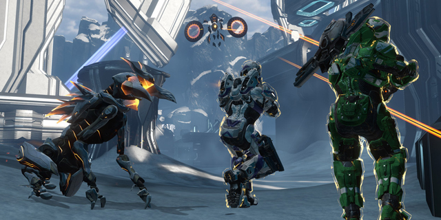
Another member of the shameful menus club is Halo 4. It’s not the look or the quickness of the menus, though they’re hardly perfect. It’s how confusing they can be when another player wants to join in on the fun. I found it very frustrating to get the campaign going co-op; once a player joins, they need to have an Xbox Live account. Or do they? Sometimes we got away with it, sometimes we didn’t.
When they could finally join the party, the game wouldn’t always default us to the next available level. We’d queue up the campaign without noticing we’d been put back at the first level instead of the fourth. I certainly don’t remember Halo 1 being this maddening. I dreaded navigating these labyrinthine menus, more than the hordes of enemies I was about to face.
Rogue Squadron II absolutely nailed it. From the appropriate use of the license, to the quick and easy transitions between screens, it never failed to put me in a great mood. The game is kind enough to give you a snippet of each level before you play it: hovering over a mission shows a very short video clip of what you’re about to expect.
The total package is required. Menus have to fit the look and feel of the game. They can’t be clunky; they can’t enrage me because I just want to change the inverted settings and get back to playing the game. They should be well organized (the opposite of The Witcher 2, essentially).
The music has to be worthy and impactful. This is the first song you’re going to present to players; it’s the perfect way to introduce them to the fantastical world your team has spent years creating. The Last of Us has a minimal, foreboding tune that is equal parts peaceful and unsettling. It fits with the moments of tranquility and madness you’ll experience during the game.
The menus are the home base, more so than the actual home base you might find in a game. There are millions of instances where gamers have fallen asleep at the menu screen and aren’t upset at all to wake up to them – a welcoming invitation to start the game, or a relaxed attitude about your refusal to go any further.