


Snackbar Games’ column carousel wraps up with Graham Russell taking a break from Multitap and Gaijin Guide to pen this edition of New Game+.
When faced with taking the baton from Andrew for a week and delving into the deeper sorts of topics in game design, I knew I had to write something about menus, because the topic is a very crucial one to everything I love. Set aside for a moment my graphic design day job, too: menu systems and general interface design can make or break local multiplayer experiences, as new players need to be able to dive in immediately, and they’re also crucial to playing import games, as if it’s done right, you know what each button and item does without having to understand any of the language. But even outside of those contexts, it’s a crucial thing, because the easiest way to keep people from enjoying a fundamentally good game is to frustrate them before they can learn the ropes.
The best menu systems are practically invisible, but that doesn’t mean they’re easily accomplished. User interface designers are a large, full-time presence in the game development process, and they have to be to give a game a shot at cohesion. That’s especially true with large, AAA-style projects, as pieces are built independently and, if UI designers aren’t vigilant, these scraps can be shoddily stitched together at the last minute as teams crunch to meet a planned release. On the opposite end, indie games are often done by teams so small that they may not have the development budget or expertise to handle interface issues, and the few developers are themselves too invested in and familiar with the game to know whether options are easy to understand for the average player.
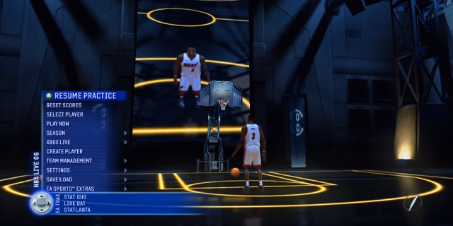
The worst offenders in menu design? If you’re looking, the best place to start is at the launch of a new system. Developers try their hardest to look “next-gen” in any way possible, and that often means reconfiguring menus to feel different. But remember, different’s not better. For example, look at early 360-PS3 era EA games like NBA Live 06. In an effort to get you “into the game” faster, you’re dropped into a practice area where you can run around and play a bit, but that’s not really a place you’d want to spend any time. To get where you actually wanted to go, you have to trigger a menu, pulling it up into a smaller space than it deserves. This means that you’ll probably also need to dig a few levels deeper into the menu to get to your standard mode. Is it a “better” experience, really, when it costs extra seconds and button presses every play?
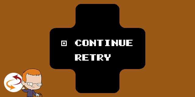
It’s not just where and how the menus are presented, either. The order of the options may seem simple, but it’s not; it requires deep analysis of how much each will need to be used by players in aggregate. Then again, some games disregard this altogether. The most classic example? Placing “New Game” above “Continue” in the title menu. It happens all the time, but it should be simple: most players will hit “New Game” once and “Continue” every single other time. Many games even make the menu smart, detecting whether there’s a game to continue first and letting your primary option, whichever it is, always be the first one presented. And yet, here we are in 2014, and some games are still getting that wrong. (Similarly, any pause menu should have the “Resume” option in the primary position. Rarely do developers mess that one up.)
In modern games, one of the largest menu dangers comes from the confluence of two elements: giving players two options and using color to indicate the highlighted item. This is often seen in yellow and white, two colors that could very well be a highlight, and with menu systems set up to cycle to the bottom of the list when you hit up at the top. (Outside of this situation, though, that’s a good feature.) This can be easily fixed by indicating the highlight in a different way, but it’s still seen way more frequently than it really should be.
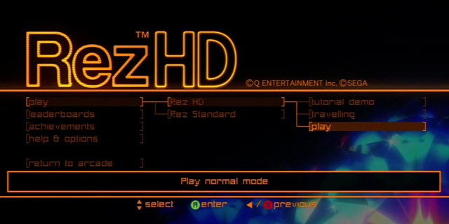
I could write pages upon pages about poor menu design systems, but it’s much harder to write about great examples, and the reason why? The best ones aren’t noticed. But let’s talk about two great examples: Mirror’s Edge and Rez HD. While both could have done a bit better with making selections more readable (a common failing in the early-HD era), I really like the approach that both took. Not only is the selection clear and the order of items the most logical, but the full width of the screen is used to let players always keep track of where they are in the menu and how to get back to other options. Too often, diving into layers of menus can leave you confused about just how to get to certain things, but both games keep interfaces nice and clean, and selections are grouped in an easy-to-understand way.
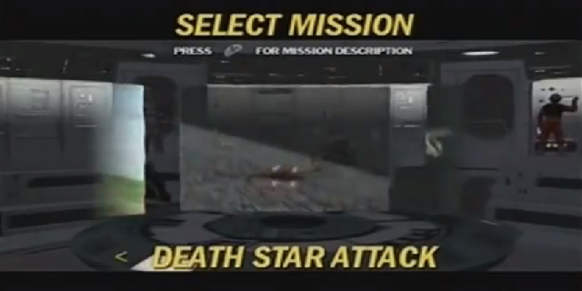
Of course, there’s more to a great menu than just usability. Bringing in thematic elements to these screens can really make for a more coherent, immersive experience, a phenomenon Henry explored in a recent Serotonin. The problem there largely comes when those elements are put above usability. He’s totally right that Star Wars: Rogue Squadron II: Rogue Leader has some cool, flashy screens that make you feel like you’re in the Star Wars world. The music evokes that feeling of nostalgia, and the video clips put the action front-and-center (and help to remind you which level is which). And looking around the hangar at your ships can be a blast, especially once you’ve unlocked special craft.
The problem? The menus themselves aren’t actually particularly usable. Where Rogue Leader drops the ball is in letting you know just exactly how robust your options are and where you happen to be in them at any given moment. These aren’t major failings, of course, as you can play the game just fine, but it presents a barrier to new players as they get lost in the audiovisual spectacle. (But hey, as spectacles go, this one’s pretty great.)
It may sound like I’m advocating for boring menus, and… well, in many ways, I am. Much can be done within an intuitive framework, but the best menus are like point guards: passing the ball where it needs to go and not worrying so much about racking up points.